Space is important to archaeologists, but it can be really easy to have a distorted sense of how big the world is, and how big different parts are compared to each other. One big reason for this globally is that common map projections tend to make more northerly and southerly places appear much larger. But on a local scale, even knowing that a place is so many square kilometres compared to some other place is not always that illuminating. It’s hard for a small human to get their head around big spaces, or abstract ones.
This all matters because what archaeologists study is the human scale of feet-on-ground, and it is easy to lose that when confronted with a top-down view, bird-in-air, which apart from anything else, is pretty much a point of view no human has ever occupied, at least until very recently. It is pretty handy then to find an easy to use online tool called MapFrappe, which allows you to outline a geographic feature, then drag it to anywhere in the world – while preserving its map projection scale.
For example, Vancouver Island is a familiar feature to many NW Coast archaeologists.
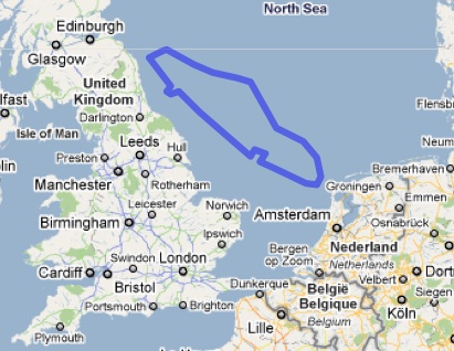
It’s a big island – it takes about eight hours to drive end-to-end, and who knows how long to walk it. But, as you can see above, it is dwarfed by Sumatra, and here below you can see it fits tidily into an empty corner of the Mediterranean, or nicely into the North Sea.
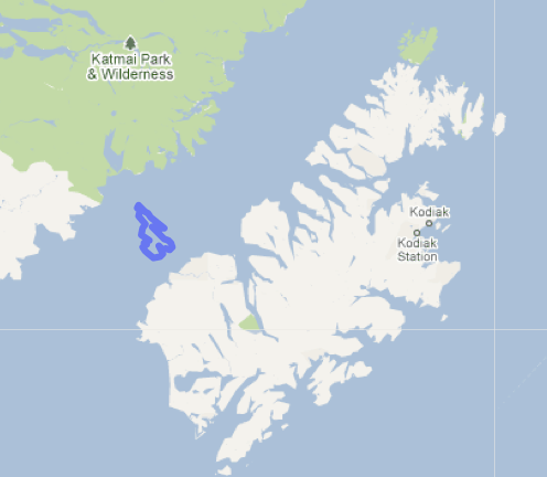
Or, at a smaller scale, Saltspring Island is one of the larger and most developed Gulf Islands. If you know Saltspring, you may have internalized an idea of how big it is. Interesting then to see it floating below near Haida Gwaii, or the Broughton Archipelago, or, most eye-opening to me, off Kodiak Island. Kodiak Island is huge, and while I might have “known that” I didn’t really feel it. It’s a good thing to know when in the future I come across Kodiak archaeology.
Similarly, working the tool in the other direction so to speak, I often end up reading about the excellent archaeological work done on the Channel Islands off Santa Barbara, California. I had never really appreciated their size, but if you had asked me, I might have said, I dunno, maybe 5 km by 5 km, or something. Well now, look below, and see Santa Rosa Island, one of the two larger ones and bigger than you’d think, floating in the Salish Sea, tempting us with visions of a fixed link.
It’s an easy tool to use. Use the navigation arrows in the upper left to zoom in on the landform you wish to trace. Then, start tracing. When you are done, scroll down the page and you will find a map you can drag the outline around on. Click “close” to close your polygon. When you want to save the URL so you can send it to your friends (or post in the comments below, hint), then you click the “URL create” button. The URL will be of where ever you have dragged your outline, so you can create several for a single example. Or, take a screen-shot.
If you want to play with the Vancouver Island map I made, go here; if you want to play with Saltspring Island (and who doesn’t, gumboots and scented candles, woohoo) then go here. Otherwise, go to MapFrappe.com, and mess around some.


Very neat. Thanks for trawling the web for such cool stuff. New Zealand is also much bigger than I ‘imagined’.
LikeLike
Re : “Vancouver Island … it takes about eight hours to drive end-to-end, and who knows how long to walk it.” FYI – from Sidney you can engage the owner of the cigarette boat that navigated Vancouver Island in 15.5hrs, for one heck of a Gulf Islands tour, including stop at the Poet’s Cove development from which considerable archaeological controversy arose.
LikeLike
A similar site – http://www.ifitweremyhome.com – although you can’t create shapes. That site is more geared to comparing countries and produces all sorts of interests stats, but note in the top menu the ‘Disasters’ tab … lean on disasters, but certainly causes pause for reflection.
LikeLike
I really like this kind of stuff. Would have been especially useful before I went to Australia, when I figured a month would be enough to tour around the whole eastern half of the continent!
LikeLike
I too love these kinds of visualizations. Much more effective than eyeballing and spinning a globe (which has no distortion, but is generally too small a scale to be very useful)! Nice to see Saltspring up against Kodiak. It would have been nice to have dropped in for a cappuccino served on a homespun placemat during one of my many near-death experiences flying in helicopters around that crazy place (especially Shelikof Strait, where you dropped it).
LikeLike
twoeyes – I think of it as trolling the web, not the indiscriminate trawling. That’ll be a beer at the arch forum.
Mad Dog – If it’s included in the 15.5 hours, that would be a quick beer at Poet’s Cove! Which would be appropriate, considering what a messed up development that is.
Morley – I am going to wildly guess, with no evidence at all, that Shelikof Strait is a volatile and nasty piece of water. Probably good windsurfing in there though, if anyone still practices that archaic sport.
LikeLike